I SPY WITH MY TYPOGRAPHIC EYE
Issue № 8 / Reading Women in Design
Long time, no see! I’m back after a couple of months with reflections on books I’ve recently read about women’s contributions, influence and experiences in design, and the vivid cover designs and illustrations from books by Peter Pauper Press.
But before that, a couple of announcements. June promises to be exciting: I’ll be in Bangalore in a few weeks, where I am going to speak about my very special project India Street Lettering at a public lecture on June 24. And that’s not all, I’m also leading a type walk in M.G. Road the very next morning on June 25. I cannot thank Sneha Joshi enough for inviting me and the Bangalore International Centre (BIC) for hosting both events. Details for the lecture and type walk are up on BIC’s website, and you can RSVP right there. If you are in Bangalore, please join us. I’d love to meet you, and I have some shiny, new printed goodies to share. If you’re not, I am also giving an online talk at TypeLab Asia on June 15 about what it has been like writing this newsletter since last summer.

A few months ago, I took a long weekend off to travel, and as is wont during any vacation — no matter how short — I made a sizeable dent in my reading list. Among the books I read were Woman’s Eye, Woman’s Hand: Making Art and Architecture in Modern India (edited by D. Fairchild Ruggles, and published by Zubaan Books) and Natural Enemies of Books: A Messy History of Women in Printing and Typography (edited by Maryam Fanni, Matilda Flodmark and Sara Kaaman, or MMS, and published by Occasional Papers). Together with Baseline Shift: Untold Stories of Women in Graphic Design History (edited by Briar Levit, and published by Princeton Architectural Press), which I had read some months prior, they catalysed a fresh attempt to make sense of my place and role as a minority voice in a globalised, and increasingly monocultural, type design world.
Rethinking women’s work
Each of these books came at the issue of women’s contributions to and influence on design from a different point of view. Woman’s Eye, Woman’s Hand explores the impact of women’s patronage, extending the concept of authorship to include the person who commissions a work. Through a series of essays, it attempts to trace how women patrons and architects shaped public taste and visual landscapes in the Indian subcontinent in the mid-19th and 20th centuries. On the other hand, Natural Enemies of Books builds on the 1937 publication Bookmaking on the Distaff Side and contrasts reproductions from it with newly-commissioned texts to broaden the feminist historiography of our profession (read a review here). Finally, Baseline Shift collects the works of over a dozen women designers and women-led initiatives from the United States, Europe and (one from) Japan that have been ignored by conventional male-centric design histories. Read together, they made for a potent vantage point.
As I was reading, it quickly became obvious to me how little I knew about collective action, bargaining and making in the printing, typography and, more widely, design world. When it comes to understanding how labour practices have evolved and how unionising has helped our predecessors negotiate better conditions and pay, I know close to nothing. While I take the time to remedy that, I want to share two trains of thought that have been living rent-free in my head since I read these books.
Ditch monoculturalism
Among the essays that drew me to Woman’s Eye, Woman’s Hand was Alisa Eimen’s piece on Begum Samru. The begum, from what I knew about her, was as enigmatic as she was shrewd. She was a landholder and military leader in the early 19th century, unique not only because of her gender, but also her ability to hold on to power in a particularly tumultuous period in the history of Delhi and its surrounding areas. None of this, however, has made her the subject of the kind and scale of scholarship one would expect.
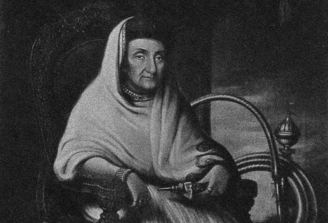
Eimen’s focus is on the art and architecture she commissioned and how she sought to craft her personage through them. Through this text, what really stood out to me was Begum Samru’s unmistakable fluency in the two cultures she moved between. Born Farzana, and later christened Begum Samru as a result of her relationship with Walter Reinhardt Sombre (corrupted to Samru), she converted to Roman Catholicism in 1781 and took the name Joanna. Aside from her own shifting religious identity, the begum’s unenviable task of engaging with local and British associates, probably brought about this cultural mobility.
In the inscriptions on the church she built in Sardhana, for instance, the English and Persian texts are not mere translations of each other. While both state the same facts, they do so using different names for Begum Samru. In addition, the former evokes the Virgin Mary, and the latter, Christ, who “appears in the Islamic tradition as a prophet”. The delicate dance to appease both constituencies, and stay true to a multicultural persona couldn’t be more apparent.
In Baseline Shift, Linda M. Waggoner similarly dissects how Angel de Cora, a Native American artist and designer with mainstream American education and training, navigated her professional life. Even though her context and time are vastly different from mine, reading about her felt very personal. Whether it was the backhanded, cringeworthy praise she received — “There was little in Angel deCora’s mature artistic style to suggest her Indian background”, wrote the Smithsonian ethnographer in 1956 — that undermined her cultural heritage, or her experience with male educators with narrow interpretations of ambition and success, it was easy for me to find parallels.
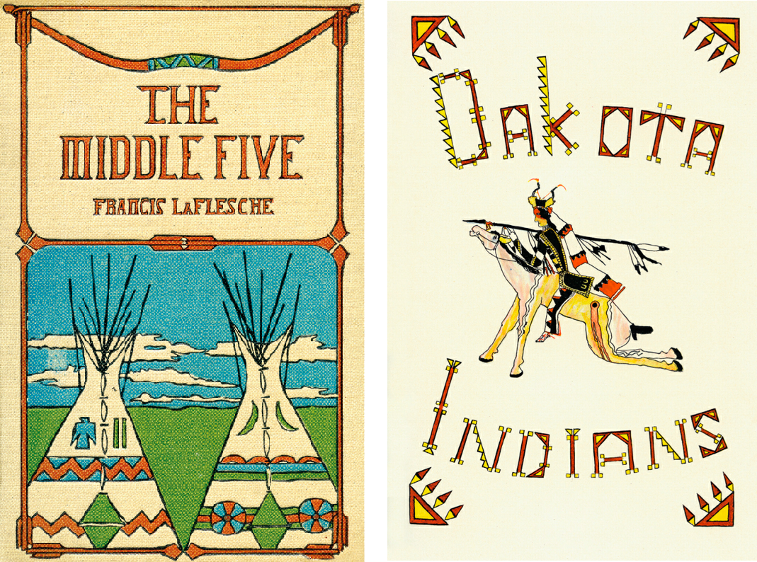
Cover of The Middle Five (1900) and lettering on the opening page of “Dakota” from The Indians’ Book (1907) by Angel de Cora. Reproduced from Baseline Shift: Untold Stories of Women in Graphic Design History.
Waggoner discusses how de Cora has not received her due in the canon despite her sizeable contributions. Besides introducing Native elements to American design, she presented herself as an example of a Native American designer and educator who eschewed the opposing binary of assimilation or rejection to espouse an approach of confluence that she saw as beneficial to her community.
It is but natural to recall Martha Scotford’s distinction between “neat” and “messy” history here, which serves as a reminder that those who cannot be pigeon-holed into tidy, unimaginative boxes are seldom celebrated in conventional, mainstream history. Step away from that bubble, and there is unfailingly more compelling and refreshing stories and work to learn from.
The more years I spend as a designer and observer, I am convinced that there is little to be gained in embracing the monoculturalism that so much type design exemplifies — whether in the style of typefaces produced or the performance of being a designer — and that I would rather emulate someone like Begum Samru, whose syncretism was clearly intentional and rooted in her complexity. I fully expect that the process of working that out for myself will be long and non-linear, but to put it crudely, I can never be “white enough” or “man enough” so why even waste time chasing those goals.
Down with stifling rules
Last year, during a chat with a handful of women colleagues, the conversation steered in the direction of belonging in the type community. We shared our experiences of being othered or looked down upon (by men) due to our indifference towards conversing exclusively in typographic facts and trivia, and having a wider, richer sets of interests far away from type design and typography. Without exception, these interactions left us discouraged, especially when we were starting out.
Imagine my amusement when I read Jane Grabhorn’s biting, deeply funny contribution to Bookmaking on the Distaff Side, which is reproduced in Natural Enemies of Books, and realised that this malady has affected Typography’s Medicine-Men [sic] for almost a century.

An excerpt from the facsimile of Jane Grabhorn’s essay “A Typographic Discourse for The Distaff Side of Printing: A Book by Ladies: From Jane Grabhorn’s Typographic Laboratory”. Reproduced from Natural Enemies of Books: A Messy History of Women in Printing and Typography.
Grabhorn’s caution against self-appointed leaders is worth heeding, as is her call to seize creative license. She imagines a radical, feminist approach to typography and printing that doesn’t conform, and instead favours ingenuity and subversion. Her piece sent me back to Paul Soulellis’s 2021 essay, What is Queer Typography?, a text I keep returning to again and again since its publication. In it, he says “At the core of typography, as it’s been taught and practiced for centuries—is control, precision, preservation of standards, the idea of perfect legibility…” Once I swallowed the hard pill that is this description, it didn’t take long to ask how much these ideals are meant to serve readers — as we are constantly told — and if (gasp!) they are largely tools of gate-keeping.

On the left: City of London Anti-Apartheid Group’s leaflet from the late 1980s, likely produced by Carol Brickley at Boldface. Fight Fascism! Fight Imperialism! designed by Carol Brickley (1980). On the right: Both reproduced from Baseline Shift: Untold Stories of Women in Graphic Design History.
Our ability to create and publish is filtered through our circumstances; ditto our desires and intentions towards these activities. Embracing that feels like the way forward to me, even if I don’t always know how in the face of homogenous narratives. Works produced in a context other than the Euro-American one, or with limited resources, alternate means of production and in precarious conditions, or not intended to serve the capitalist machinery, are not less-than because of their ignorance or disregard for so-called universal design conventions. On the contrary, they offer a glimpse into what can be. And I want to continue learning how to see that without prejudice.
Books by Peter Pauper Press
To round off this newsletter it feels apropos to share cover designs and art from some Peter Pauper Press volumes in my collection. Edna Beilenson, who ran Peter Pauper Press with her husband, Peter Beilenson, between 1932–62 and then on her own for another two decades after his death, was an instigator and contributor to Bookmaking on the Distaff Side.

One detail that has always intrigued me about Peter Pauper Press is the partnership between husband and wife. This type of arrangement is all too common in the design world even today. My own brush with working with my partner (who is not a designer) on occasion has left me with more questions than answers about the personal and political implications of such a professional association. All three books from above touch upon the issue as well. Baseline Shift carries an essay by Sarah McCoy about early colonial women printers in the US that sheds light on the contributions of some women who either ran businesses with their husbands, or took over upon being widowed. In her text about women architects in independent India in Woman’s Eye, Woman’s Hand, Madhavi Desai bluntly outlines the benefits and drawbacks for women in spousal partnerships in architecture. Perhaps most interesting of all is Alison W. Davis’s personal account from Bookmaking on the Distaff Side reproduced in Natural Enemies of Books, where she recollects how she chose to participate in the printing trade of her own volition, and not by marrying into it.
A few years ago, Tânia Raposo wrote a delightful piece on Alphabettes about Peter Pauper Press and their cookbooks, Edna Beilenson’s contributions to their distinctive visual style and some of the women illustrators and graphic artists they worked with. Rather than repeat a lot of what she said, I’ll leave you instead with images from some books by the press that draw on Indian subjects.
It wasn’t much of a surprise to me that the books were all focused on Indian ideas of wisdom and love: Hindu Proverbs and Wisdom compiled by Narendra K. Sethi and illustrated by Jeff Hill, The Secret Delights of Love [from the Sanskrit] by the Pundit Bilhana, translated by Gertrude Clorius Schwebell and illustrated by Gerhard Gollwitzer, and India Love Poems selected by Tambimuttu with decorations by Pat Stewart.

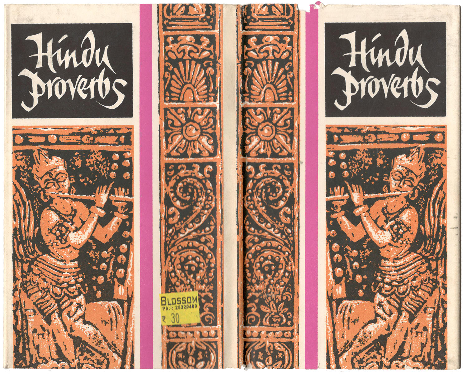
In all three books, the cover design as well as the art inside features Peter Pauper Press’s trademark use of colour blocking and bold illustrations. I’m all for the calligraphed book titles too. Though the depiction of “Indian” motifs is, for the lack of a better word, unimaginative.


I was so thrilled to find a small morsel of Devanagari in one of the books. I am yet to solve the mystery of the type’s provenance, but seeing bibliographic information at the end as one would in a manuscript or even early lithographed book, is always a pleasure.
And on that happy note I’ll sign off, but not without thanking my internet friend, Padmaparna, who got me Natural Enemies of Books as a gift and set this ball rolling. See you next month!
